When Researching I tend to use the web as a first port of call using website like def grip, it’s nice that and FFFFOUND if I then find an artist whose work really grabs my attention or relates to the work I doing I will usually look for books, interviews and any publications they have been in this lets me get a better understanding of the way in which they work, something which I think greatly helps me to push my own practice. This was the case for most of the artist below.
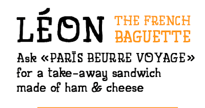
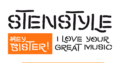
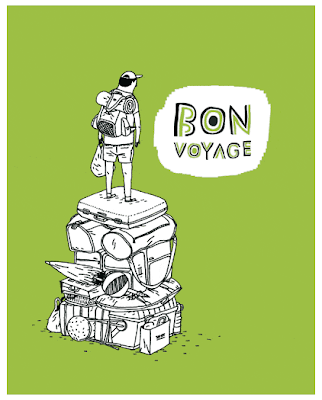
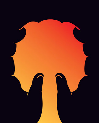
French illustrator Quentin vijoux is relatively new to me but his hand render type faces which are then turned to vector shapes without losing the charm they have is really inspiring to see for me as an illustrator for as it is the way I have been working for a while creating hand drawn images which I then turn to vectors through the use of illustrator and it is executed so well through out his work.
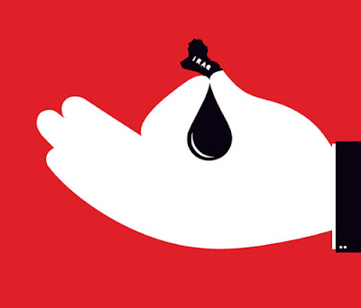
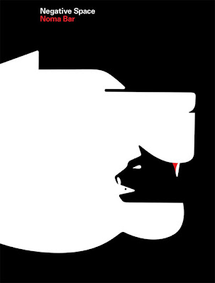
Another contemporary artist that really inspired me through this project was the Noma Bar, I have found no other who can use negative space so clever, with slight humour but always conveying a message. The use of negative space really interests me and through out this unit I have been heavily thinking of ways in which I can use it within my work to my advantage as well as a clean over all composition.
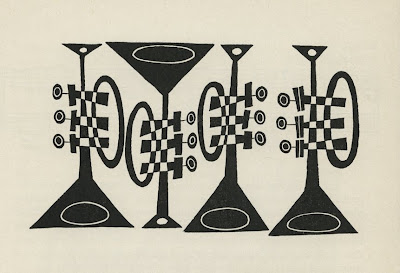
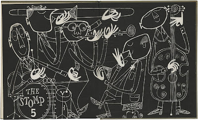
I have also looked at some more historical artists such as Cliff Roberts know for his work on animated TV shows such as pink panther, but what mainly interested me was a illustrated book on jazz he’d done in 1955 the illustrations are amazing and the use of removing the black line and inverting the black and white is what most strikes me as something I’ve taken from his work and used in my own.

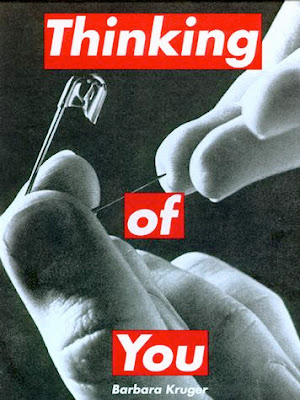
Barbara Kruger with out a doubt shows how a relationship between word and image can be done to great effect, having previously looked at her work in contextual theory I then further researched her for this project, the link between word and image is what this whole project has been about for me and looking at it in the form of something as basic as cut out text on top of a photograph really helps to get an understanding of how it is done which then can be applied to my own work.

.jpg)


